Creating a website isn’t just about design anymore—it’s about making sure that every interaction, every click, and every second spent on your site supports your visitors and guides them toward a goal. Whether you’re a local business in St. Louis or running a national brand, user experience (UX) matters more than ever. But how do you really know what’s working and what’s not on your website?
The answer lies in data. Specifically, in two tools that have transformed how we understand and improve user behavior: heatmaps and analytics. By using both in tandem, businesses can uncover hidden issues and make smart, measurable changes that lead to better usability and more conversions.
What Are Heatmaps and Why Should You Use Them?
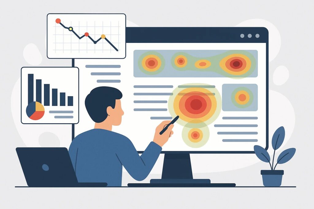
Heatmaps are visual tools that show where users interact with your website. Using colors to indicate activity—cool colors like blue for low engagement, warm tones like red and orange for higher interaction—they let you quickly understand how people engage with your content.
There are different kinds of heatmaps, each offering a unique insight:
- Click Maps show where users click, including unexpected areas like headers or images.
- Scroll Maps reveal how far down the page people are scrolling. You can see if important content is being missed.
- Mouse Movement Maps track where users hover their cursors, often reflecting where their eyes are focused.
These visual insights help you figure out whether users are actually seeing your content, getting confused, or missing key actions.
Website Analytics: The Numbers Behind User Behavior
While heatmaps are great for visual feedback, analytics tools—like Google Analytics—offer hard data that supports your observations. These tools track visitor behavior across your website in precise detail.
Here are some of the key metrics to pay attention to:
- Bounce Rate: How many visitors leave your site after viewing only one page?
- Average Session Duration: How much time do users spend on your site?
- Pages per Session: Are users exploring or leaving quickly?
- Conversion Rates: How many users are taking meaningful actions—like filling out a form or making a purchase?
- User Flow: What paths do visitors take as they navigate your site?
This type of data is critical for spotting patterns and understanding how visitors move through your site.
Combining Heatmaps with Analytics for Better Results
On their own, heatmaps and analytics are useful. Together, they’re powerful. Let’s say one of your service pages is getting plenty of traffic but not many leads. Analytics might show that users are bouncing fast. A heatmap might reveal that most users aren’t scrolling past a large image or that they’re clicking on something that isn’t interactive.
This combination of insights gives you a clearer picture:
- Maybe your call-to-action is buried too low on the page.
- Perhaps your layout is misleading.
With this information, you can rearrange elements, clarify messaging, or streamline navigation. After making adjustments, you can track whether these changes actually improve performance using the same tools.
A Real Example: A St. Louis Business Makes the Shift
Imagine a local dentist in St. Louis who recently launched a new homepage. It looked great on desktop, with high-quality visuals and bold headlines. But inquiries from the website didn’t increase.
When the team checked Google Analytics, they saw a high bounce rate and low time on page. The heatmap revealed the problem: most users weren’t scrolling beyond the first screen, and the “Book Now” button was far below the fold.
They moved the CTA higher, rewrote the headline to better address user concerns, and added trust-building testimonials up top. One month later, bounce rate dropped by 25%, and appointment bookings doubled.
Tips for Using Data to Improve Usability
- Focus on Key Pages: Start with your homepage, services pages, and lead capture forms.
- Segment Your Users: Break down data by device, traffic source, or geography to find unique behavior patterns.
- Use Multiple Tools: Google Analytics paired with heatmap tools like Hotjar or Microsoft Clarity gives a well-rounded view.
- Test Small Changes: Don’t guess—test layout or content changes with A/B tests.
- Stay Consistent: Usability isn’t a one-time fix. Check your heatmaps and data every few weeks.
Useful Tools for the Job
- Google Analytics: Best for big-picture traffic and user behavior.
- Hotjar: Offers heatmaps, visitor recordings, and feedback polls.
- Crazy Egg: Combines heatmaps with A/B testing.
- Microsoft Clarity: Free and packed with features like scroll depth and session replays.
The Takeaway: Data Is Your Best Design Partner
Improving website usability doesn’t have to involve guesswork. By combining visual heatmaps with hard data from analytics, businesses can make decisions grounded in user behavior, not opinion.
Whether you’re building a brand or optimizing an existing site, these tools can help you uncover friction points, highlight what’s working, and ultimately create a better experience for your visitors. In today’s digital marketplace, where customer attention is fleeting and competition is fierce, that kind of clarity can be a serious advantage.
Let your users show you the way—literally. Read their behavior, adjust accordingly, and watch your website start to work for your business, not against it.
The written content on this page was generated by ChatGPT.