In a city like St. Louis, where local pride meets modern growth, your website design needs to do more than just function—it needs to speak to your audience. One often-overlooked part of this conversation is whether to use dark mode or light mode for your website. What started as a visual preference is now a design decision that can impact how users interact with your brand.
As more local businesses go digital, understanding the benefits and drawbacks of each design mode isn’t just helpful—it’s smart strategy.
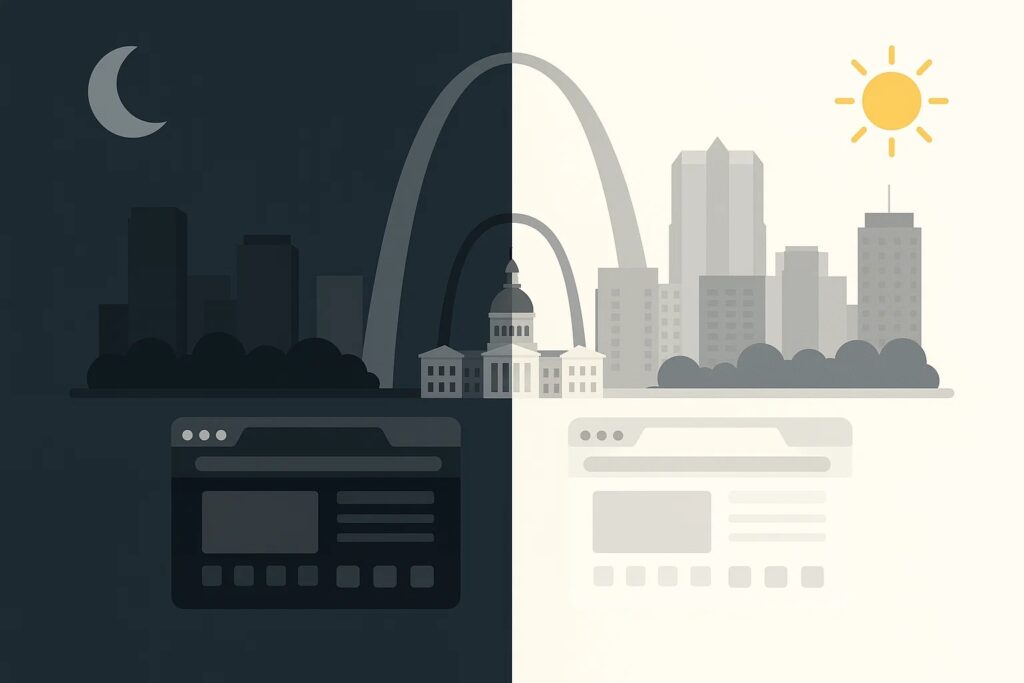
First Things First: What Do Dark Mode and Light Mode Mean?
Light mode presents dark text on a lighter background, most often black text on a white backdrop. This is the traditional, familiar setup that most people have seen on websites for years.
Dark mode flips this around: light-colored text appears on a dark or black background. Originally a feature for developers and designers, it’s now a user-driven preference supported on most devices and browsers.
For business owners in St. Louis, especially those thinking about how design affects brand trust, understanding how each of these looks and feels is the first step toward making a strong decision.
Why Light Mode Still Works
Light mode continues to be the go-to for many industries, especially where clarity and professionalism are key. It helps people process information quickly, especially when reading long blocks of text.
When Light Mode Works Best:
- In bright, well-lit settings
- For content-heavy websites like blogs or service descriptions
- When targeting a more traditional audience
St. Louis Examples: If you run a legal office in Clayton or a financial firm in Chesterfield, light mode can help give your site the clean, reliable appearance customers expect.
The Rise of Dark Mode
Dark mode has gained traction because it’s easy on the eyes and gives websites a sleek, modern feel. It’s not just for show—users are increasingly choosing websites and apps that offer dark mode, especially for late-night browsing or mobile use.
Benefits of Dark Mode:
- Easier on the eyes in dim light
- Can save battery life on OLED screens
- Makes images and videos stand out more
Best Fit for Dark Mode in STL: Creative industries in The Grove or Central West End—such as web agencies, designers, or photographers—can use dark mode to show off portfolios in a dramatic, eye-catching way.
How Users React Emotionally
Colors do more than decorate; they set the tone. Light backgrounds often feel open, clean, and business-like. Dark mode leans toward bold, innovative, or creative energy.
If your customers are older or coming to you for trustworthy services (like home repair or medical help), light mode may feel more comfortable. But if you’re targeting trend-conscious shoppers or a younger tech-savvy crowd, dark mode might better match their expectations.
What About Accessibility?
Design should be inclusive. While dark mode can help reduce screen fatigue, not all implementations are equal. Some dark themes cause strain or confusion if text isn’t readable or contrast isn’t high enough.
Design Tips:
- Avoid pure black backgrounds; softer dark shades are easier on the eyes
- Keep enough contrast between text and background
- Make sure buttons, links, and forms remain visible and intuitive
Whether you choose light or dark, what matters is testing your site’s design with real users—especially if you serve a diverse community like South City or North County.
SEO and Site Performance
Your site’s color mode doesn’t directly affect your ranking on Google. But it does influence user behavior—like how long someone stays on your site, whether they click through, or how likely they are to return.
Sites that load fast and are easy to use often perform better in search rankings. Minimalist dark designs might load quicker, but that benefit is minor compared to things like mobile responsiveness or image optimization.
Give Users the Choice
One smart solution is to let people choose. Many websites now include a toggle between dark and light modes. This can be automatic—based on the user’s device settings—or manual, where visitors choose what suits them.
How to Do It Right:
- Design both themes to match your branding
- Ensure all functionality works the same in both modes
- Highlight important content clearly in both options
Giving control to the user increases satisfaction, which means they’re more likely to stay on your site and engage with your content.
Local Focus: Your Brand in the St. Louis Landscape
Think about how your business fits into the local scene. Are you rooted in tradition or reaching toward innovation? Light mode might align with classic values, while dark mode might help position you as forward-thinking.
Ask Yourself:
- What kind of impression am I trying to make?
- Who is my ideal customer?
- What’s my competition doing, and how can I stand out?
It’s Not One-Size-Fits-All
There’s no universal answer when it comes to choosing dark or light mode. What’s most important is that your choice supports your brand’s goals, reflects your customer’s preferences, and enhances the user experience.
For St. Louis businesses, whether you’re downtown, in the suburbs, or working across the region, how your website looks isn’t just about design—it’s about communication, trust, and staying relevant in a crowded digital space.
Choose wisely, test thoroughly, and don’t be afraid to evolve as your audience changes. That’s how smart St. Louis brands stay ahead.
The written content on this page was generated by ChatGPT.